Creating Shelves That Invite a Second Look
It’s easy to fill a shelf. It’s harder to build one that makes you pause.
The best shelves feel more like compositions than storage. They have rhythm, texture, and space to breathe. Whether you’re working with open bookshelves, a floating ledge, or a built-in alcove, a few small decisions can turn any surface into a quiet focal point.
Here’s how to design a shelf you’ll actually enjoy looking at — and living with.
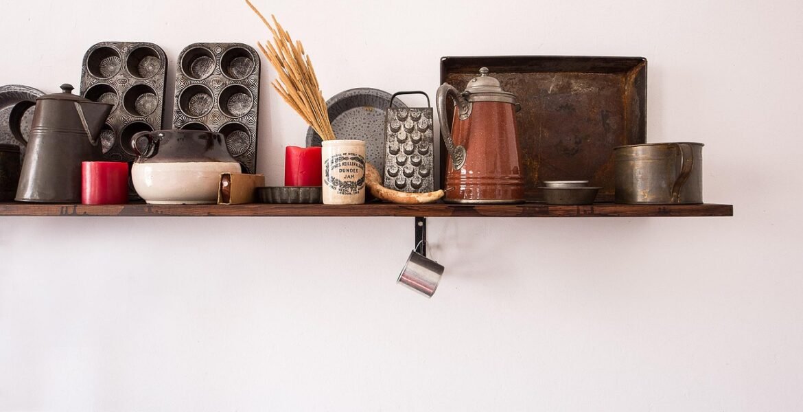
Start with One Anchor
Choose one object with visual weight to set the tone. It might be a ceramic vessel, a stack of hardcovers, or a folded textile. This anchor helps create a sense of gravity — a pause that draws the eye and lets other pieces fall into rhythm around it.
Let its shape and tone guide the rest of the arrangement. An earthy stone pot might call for soft textures around it. A stack of books could suggest a gentle vertical pull. Don’t rush this first step — the anchor is what steadies the whole scene.
Play With Height and Scale
Balance is more interesting than symmetry. A few tall elements help create movement — they pull the gaze upward and keep the shelf from reading as a flat plane. Try a slender vase, a standing frame, or a candlestick with a sculptural profile.
Then let your eye drop again. Layer shorter objects near or in front — a match striker, a small bowl, a horizontally stacked book. Think of it like a skyline, with peaks and valleys. This contrast adds both rhythm and breath.
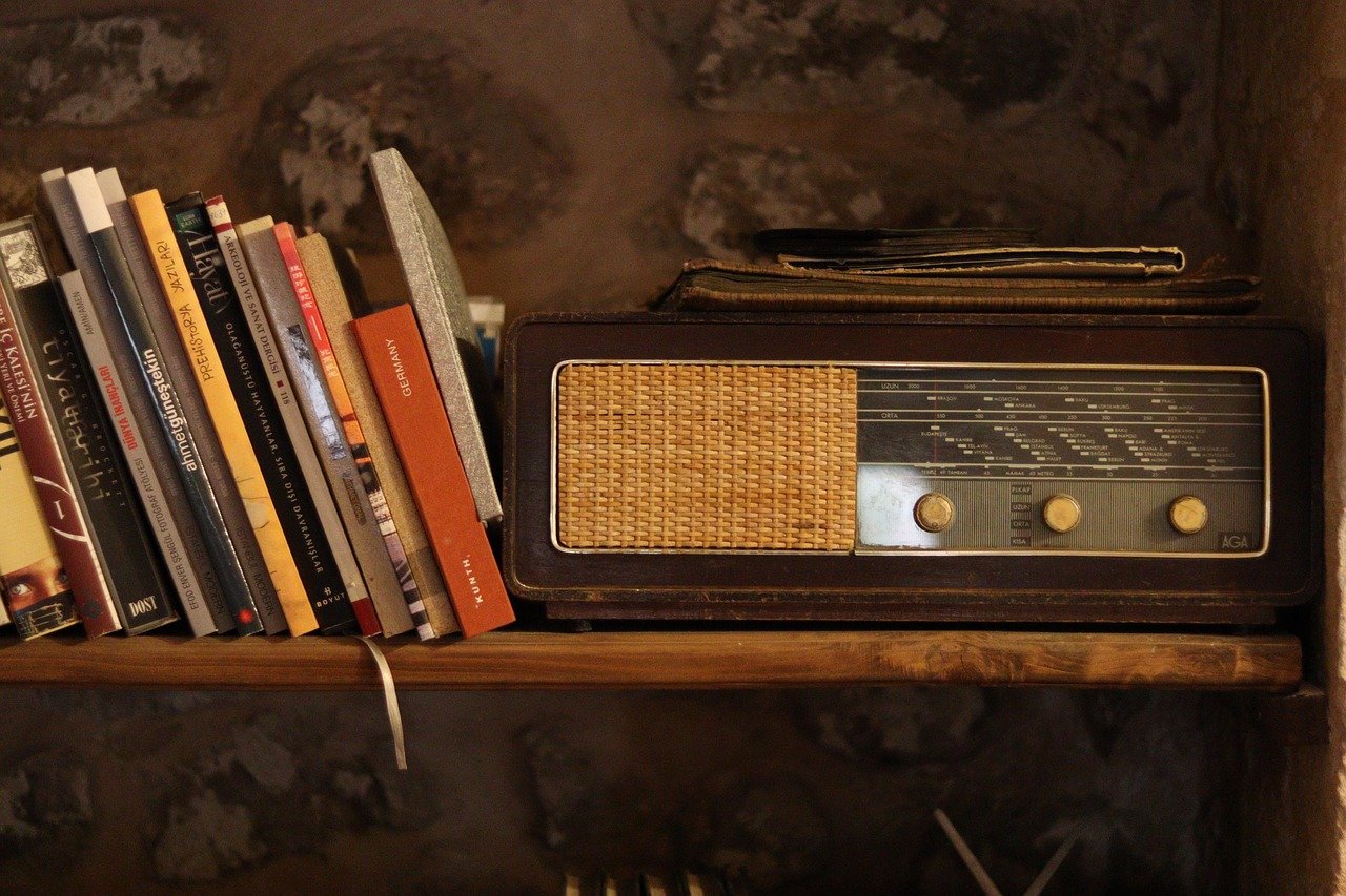
Add Texture in Small Doses
Visual texture slows the eye. It invites touch, even from a distance. A linen-bound journal, a leather catchall, a raw ceramic cup — these don’t just fill space; they soften it.
Use texture sparingly, and contrast it thoughtfully. Pair matte with gloss, rough with smooth, old with new. These quiet oppositions keep a shelf from feeling too flat or too polished. The goal is richness, not clutter.
Leave Space
Negative space is as important as any object. It gives each item room to resonate. Leave small areas untouched — especially at the ends or corners of a shelf — to help the arrangement feel settled, not overthought.
If everything touches, nothing stands out. A little room between pieces lets you notice what’s there. And just as important, it lets you breathe as you look.
Balance the Tones
Color doesn’t need to be matched — it needs to be echoed. Pick two or three tones you’re drawn to and let them show up subtly across the shelf. A pale wood here, a bit of warm metal there, a soft blue that repeats in small ways.
Too much consistency can feel staged. Too much variety can feel restless. Repetition with variation — a similar finish in two forms, or a shared hue across different materials — creates quiet cohesion.
Make One Thing Personal
A photo, a letterpress card, a stone from a trip — something that doesn’t try too hard but means something to you. This is the piece that grounds the shelf in your life. It doesn’t need to be front and center. It just needs to be real.
Design can be beautiful and still personal. The most compelling shelves hint at a life beyond the objects.
Think in Layers, Not Lines
Instead of lining things up, think in small groupings — clusters that overlap gently, creating a sense of depth. A framed print leaning behind a vessel, a small object in front of a book stack — these moments make the shelf feel lived in, not arranged.
Vary how far forward things sit. Let some pieces hover near the edge, others tuck back. It creates a natural visual rhythm, like a sentence with commas and pauses.
A Final Thought
A good shelf isn’t packed — it’s paced. With the right rhythm and a few meaningful choices, even the most ordinary ledge can become something quietly beautiful. Start with what you already have. Let the space grow into itself.
It’s not about getting it perfect. It’s about letting the objects you live with find their shape. And in turn, helping your space feel a little more like home.
Trending…